
Drops and Buienalarm Brand
Brand Design
Drops and Buienalarm are two brands from the same company, offering the same weather service. Drops caters to English-speaking users, while Buienalarm serves the Dutch market, providing real-time weather alerts in their respective languages.
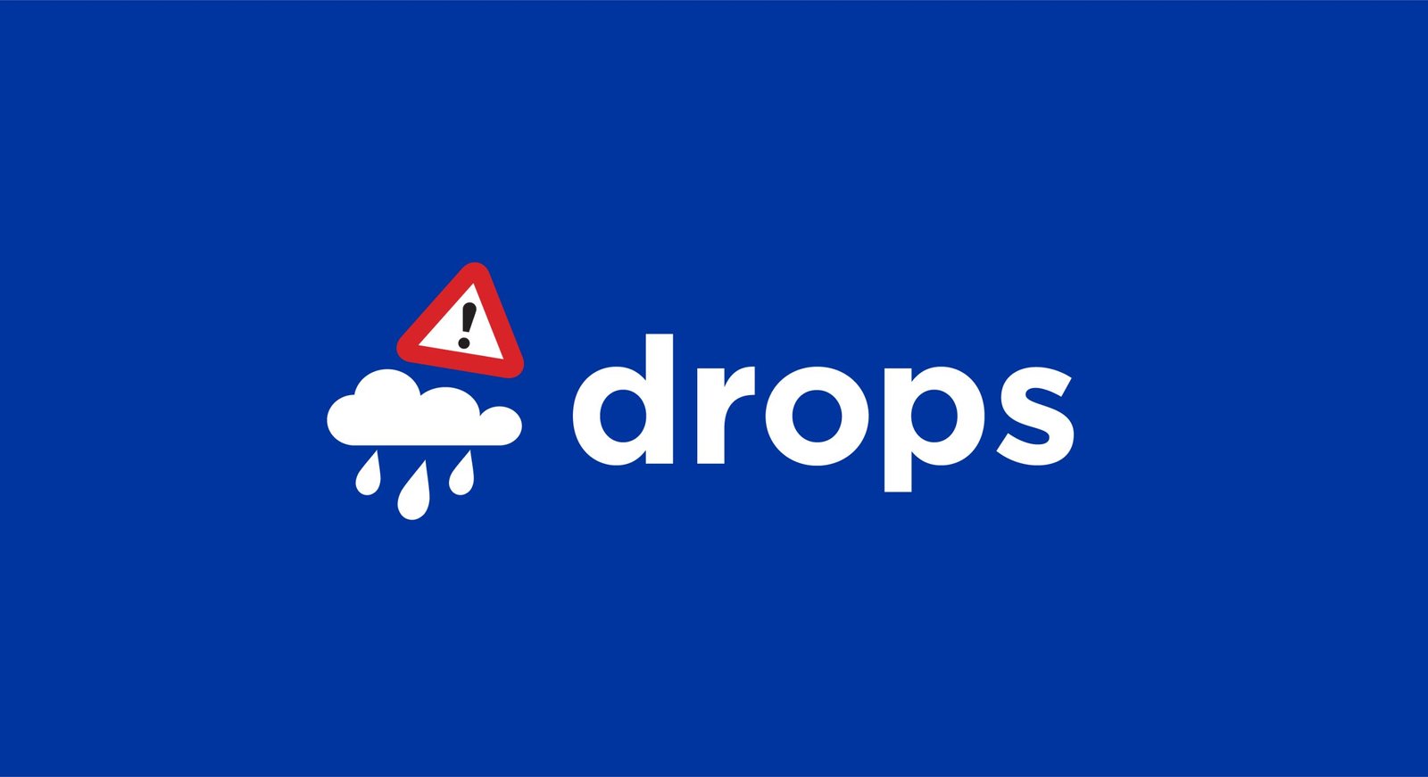
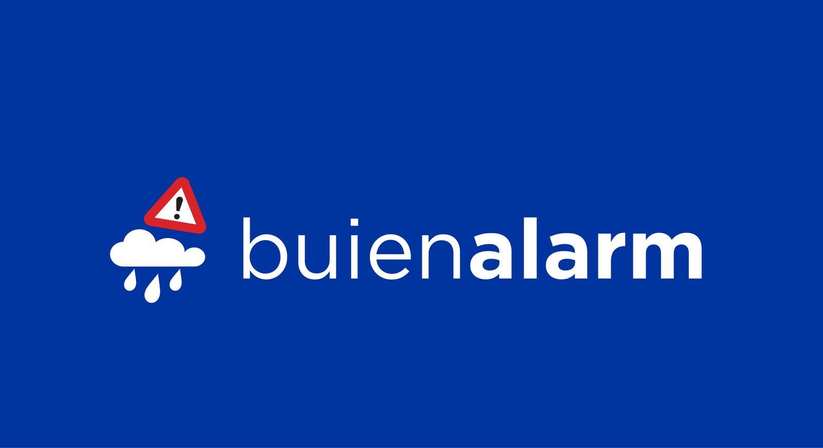
Drops and Buienalarm share the same core functionality, delivering real-time weather alerts with a focus on accuracy. Both brands are tailored to different language audiences—Drops for English speakers and Buienalarm for Dutch users.
The design language of each brand reflects its target market’s needs. The brands embodies a fresh and fluid aesthetic with clean lines and soft, approachable visuals, emphasizing ease of use and a lifestyle-oriented feel. The logos conveys urgency and precision, using bold colors to prioritize quick readability and immediate action. Both brands ensuring seamless access to weather updates across all devices.
Drops features a bold font, creating a strong and confident presence, while Buienalarm balances bold and light fonts to convey both urgency and clarity. Despite these typographic differences, the core concept remains consistent across both brands.

The font used in the logo would likely reflect these attributes through smooth, rounded shapes, a clean and modern sans-serif style, and an overall approachable feel.
Home Screen Performance:
On the home screen, the Buienalarm icon is easily distinguishable among other app icons due to its bold use of color and clear visual hierarchy. The blue background contrasts sharply with the red triangle, which houses the exclamation mark symbolizing urgency. The cloud and raindrop imagery are straightforward, immediately communicating that the app is weather-related.
- Legibility: The white cloud and raindrops are crisp and remain legible even at smaller sizes, which is essential for quick recognition on mobile screens.
- Attention-grabbing: The red warning triangle draws immediate attention, reinforcing the app’s purpose of delivering urgent weather updates.
- Balance: The icon is well-balanced with visual weight distributed between the cloud and the triangle, making it appear stable and professional on the screen.
App Store Performance:
In the App Store, the icon retains its clarity even at smaller sizes. The use of strong, simple shapes ensures that the design doesn’t lose detail or meaning when scaled down, which is important for listings in search results or top charts.
- Recognition: Among other apps in the App Store, the icon stands out due to its unique combination of colors and symbols, offering both recognizability and differentiation.
- Scalability: The clean design ensures that essential elements (the warning triangle and raindrops) are clear even at very small sizes, making the app identifiable at a glance in crowded interfaces like the App Store rankings.
