Identity for infoplaza
Brand Design
The balance between simplicity and vibrancy makes the logo both engaging and memorable.
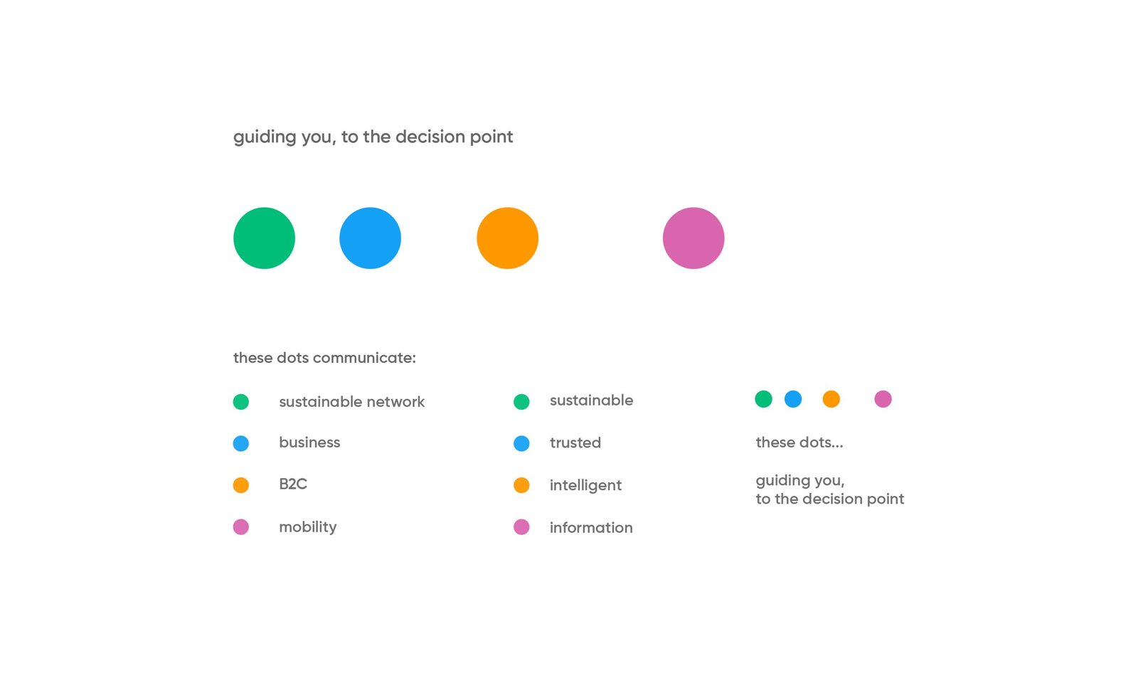
This logo communicates a fresh, contemporary, and professional identity. The use of color-coded circles to represent different areas of the business highlights the company’s diversity, while the clean typography emphasizes a modern, reliable brand.

This screen presents a wireframe or grid-based outline of the “infoplaza” logo, which provides insight into the structure and precise alignment used in the design process. The font used for “infoplaza” is simple, sans-serif, and lowercase, which gives the brand a friendly, approachable, and modern feel. The rounded edges of the letters convey a sense of softness and professionalism without being overly formal.

The font used in the logo would likely reflect these attributes through smooth, rounded shapes, a clean and modern sans-serif style, and an overall approachable feel.

Tthis image emphasizes the cohesive design approach where the circles, extracted from the letterforms, align with the typography. This visually ties the logo elements together, reinforcing consistency and balance. The derived shapes give the logo a harmonious and structured appearance, enhancing its conceptual integrity.

The placement of the icon to the right of the brand name ensures the text remains the focal point while adding an extra element of interest. The balance between text and icon is well-proportioned, keeping the logo compact and easily recognizable.

Final logo.

The choice of multiple vibrant colors contrasts with the simplicity of the black typography. The colors likely represent different aspects of the company’s services or areas of expertise, creating a visual metaphor for diversity and integration.


